
body.postid-8867 #main-header, body.postid-8867 #main-footer, body.postid-8867 .et-l–header, body.postid-8867 .et-l–footer, body.postid-8867 .qlwapp, body.postid-8867 .qlwapp__container, body.postid-8867 .grecaptcha-badge, body.postid-8867 #wp-ai-studio-container, body.postid-8867 .entry-title { display: none !important; } body.postid-8867 #page-container { padding-top: 0 !important; } body.postid-8867 #main-content { padding: 0 !important; background: #fff !important; } body.postid-8867 #main-content > .container, body.postid-8867 #main-content .container, body.postid-8867 #left-area, body.postid-8867 article.page, body.postid-8867 article.project, body.postid-8867 .entry-content { width: 100% !important; max-width: none !important; margin: 0 !important; padding: 0 !important; float: none !important; } body.postid-8867 #main-content .container::before { display: none !important; } body.postid-8867 #sidebar { display: none !important; } body.postid-8867 .h96wp-v1 { min-height: 100vh; } :root { –ink: #122033; –muted: #617084; –navy: #071522; –navy-2: #0d2538; –blue: #0b6ed1; –blue-dark: #075cae; –cyan: #35c0ce; –line: #d9e2eb; –soft: #f4f7fa; –white: #fff; –shell: 1240px; –radius: 18px; –shadow: 0 26px 65px rgba(4, 24, 45, .12); } * { box-sizing: border-box; } [hidden] { display: none !important; } html { scroll-behavior: smooth; } body { margin: 0; color: var(–ink); background: #fff; font-family: Inter, ui-sans-serif, -apple-system, BlinkMacSystemFont, “Segoe UI”, sans-serif; font-size: 16px; line-height: 1.62; -webkit-font-smoothing: antialiased; } body.menu-open { overflow: hidden; } img { display: block; max-width: 100%; } a { color: var(–blue); text-underline-offset: .2em; } button, input, select, textarea { font: inherit; } :focus-visible { outline: 3px solid var(–cyan); outline-offset: 3px; } h1, h2, h3 { margin: 0 0 .65em; color: var(–ink); font-weight: 760; letter-spacing: -.04em; line-height: 1.06; text-wrap: balance; } h1 { font-size: clamp(3rem, 6vw, 6.3rem); } h2 { font-size: clamp(2.15rem, 4vw, 4.1rem); } h3 { font-size: 1.3rem; letter-spacing: -.025em; } p { margin: 0 0 1.2em; } .shell { width: min(calc(100% – 3rem), var(–shell)); margin-inline: auto; } .section { padding-block: clamp(5rem, 8vw, 8.5rem); } .section-tight { padding-block: clamp(3.5rem, 6vw, 6rem); } .skip-link { position: fixed; z-index: 999; top: -80px; left: 1rem; padding: .8rem 1rem; color: #fff; background: var(–blue); } .skip-link:focus { top: 1rem; } .preview-bar { display: flex; min-height: 32px; align-items: center; justify-content: center; gap: 2rem; padding: .35rem 1rem; color: #dce8f4; background: #04101b; font-size: .68rem; font-weight: 650; letter-spacing: .04em; text-transform: uppercase; } .preview-bar span + span { color: #66d5dd; } .site-header { position: sticky; z-index: 100; top: 0; border-bottom: 1px solid rgba(8, 28, 48, .08); background: rgba(255, 255, 255, .96); box-shadow: 0 8px 26px rgba(5, 25, 44, .045); backdrop-filter: blur(16px); } .header-inner { display: flex; min-height: 78px; align-items: center; gap: clamp(1rem, 3vw, 2.8rem); } .brand { display: inline-grid; grid-template-columns: auto auto; flex: 0 0 auto; align-items: baseline; color: var(–navy); font-size: 1.45rem; font-weight: 900; letter-spacing: -.075em; line-height: .9; text-decoration: none; } .brand span { color: var(–blue); } .brand b { font-weight: 900; } .brand small { grid-column: 1 / -1; margin-top: .32rem; color: #6e7d90; font-size: .38rem; font-weight: 850; letter-spacing: .19em; } .primary-nav { display: flex; flex: 1; justify-content: center; gap: clamp(.35rem, 1.35vw, 1.35rem); } .primary-nav a { padding: .9rem .2rem; color: #334256; font-size: .79rem; font-weight: 730; text-decoration: none; } .primary-nav a:hover { color: var(–blue); } .h96-language-switcher { position: relative; display: inline-flex; flex: 0 0 auto; align-items: center; } .h96-language-switcher > span { position: absolute; width: 1px; height: 1px; overflow: hidden; clip: rect(0 0 0 0); clip-path: inset(50%); white-space: nowrap; } .h96-language-switcher select { width: 90px; height: 42px; padding: 0 1.75rem 0 .7rem; border: 1px solid #cdd8e3; border-radius: 8px; color: #334256; background: #fff; font-size: .75rem; font-weight: 780; line-height: 1; cursor: pointer; } .h96-language-switcher select:hover { border-color: #9eb5cc; } #h96-google-translate-element { position: fixed !important; left: -9999px !important; width: 1px !important; height: 1px !important; overflow: hidden !important; } .goog-te-banner-frame.skiptranslate, #goog-gt-tt, .goog-te-balloon-frame { display: none !important; } html body { top: 0 !important; } .menu-toggle { display: none; margin-left: auto; border: 0; background: transparent; color: var(–ink); font-size: .8rem; font-weight: 750; } .menu-toggle i, .menu-toggle i::before, .menu-toggle i::after { display: block; width: 20px; height: 2px; content: “”; background: currentColor; } .menu-toggle i { position: relative; margin-left: .65rem; } .menu-toggle i::before { position: absolute; top: -6px; } .menu-toggle i::after { position: absolute; top: 6px; } .button { display: inline-flex; min-height: 52px; align-items: center; justify-content: center; padding: .86rem 1.3rem; border: 1px solid transparent; border-radius: 8px; font-size: .84rem; font-weight: 800; line-height: 1; text-decoration: none; cursor: pointer; transition: transform .2s ease, background .2s ease, border-color .2s ease; } .button:hover { transform: translateY(-2px); } .button-small { min-height: 42px; padding: .72rem 1rem; } .button-primary { color: #fff; background: var(–blue); } .button-primary:hover { color: #fff; background: var(–blue-dark); } .button-secondary { color: var(–blue); border-color: #aec4dc; background: #fff; } .button-light { color: var(–navy); background: #fff; } .button-light-dark { color: var(–navy); background: #fff; } .button-outline { color: #fff; border-color: rgba(255, 255, 255, .55); background: transparent; } .button-row { display: flex; flex-wrap: wrap; gap: .75rem; } .eyebrow { margin: 0 0 .95rem; color: var(–blue); font-size: .7rem; font-weight: 850; letter-spacing: .17em; line-height: 1.3; text-transform: uppercase; } .lead { color: #425168; font-size: clamp(1.05rem, 1.8vw, 1.35rem); line-height: 1.55; } .text-link { display: inline-flex; align-items: center; gap: .45rem; color: var(–blue); font-size: .82rem; font-weight: 800; text-decoration: none; } .text-link span { transition: transform .2s ease; } .text-link:hover span { transform: translateX(4px); } .text-link.light { color: #71d9df; } .section-heading { max-width: 820px; margin-bottom: clamp(2.7rem, 5vw, 4.5rem); } .section-heading.row { display: flex; max-width: none; align-items: end; justify-content: space-between; gap: 4rem; } .section-heading.row > div { max-width: 720px; } .section-heading.row > p { max-width: 430px; margin-bottom: .4rem; color: var(–muted); } .hero { position: relative; overflow: hidden; color: #d3deec; background: var(–navy); } .hero::before { position: absolute; width: 700px; height: 700px; top: -360px; right: -160px; border-radius: 50%; background: rgba(16, 122, 210, .16); content: “”; filter: blur(1px); } .hero-grid { position: relative; display: grid; min-height: 735px; grid-template-columns: 1.04fr .96fr; align-items: center; gap: clamp(2rem, 7vw, 7rem); padding-block: 5.5rem 6.5rem; } .hero-copy { position: relative; z-index: 2; } .hero .eyebrow { color: #65d7de; } .hero h1 { max-width: 790px; color: #fff; font-size: clamp(3.4rem, 6.1vw, 6.1rem); } .hero .lead { max-width: 680px; margin-bottom: 2rem; color: #becbdd; } .hero-note { margin: 1.35rem 0 0; color: #8fa0b5; font-size: .75rem; } .hero-visual { position: relative; min-height: 570px; } .hero-visual::before { position: absolute; inset: 9% 2% 4% 9%; border: 1px solid rgba(255,255,255,.12); border-radius: 42% 58% 55% 45% / 48% 44% 56% 52%; content: “”; transform: rotate(-8deg); } .orbit { position: absolute; border: 1px solid rgba(67, 198, 216, .25); border-radius: 50%; } .orbit-one { inset: 21% -6% 13% 18%; transform: rotate(17deg); } .orbit-two { inset: 8% 14% 27% 2%; transform: rotate(-24deg); } .hero-product { position: absolute; overflow: hidden; border: 1px solid rgba(255,255,255,.14); border-radius: 22px; background: #fff; box-shadow: 0 34px 80px rgba(0,0,0,.34); } .hero-product img { width: 100%; height: 100%; object-fit: cover; } .hero-product > span { position: absolute; z-index: 2; top: 1rem; left: 1rem; padding: .42rem .58rem; border-radius: 999px; color: #dbe8f4; background: rgba(6, 21, 34, .78); font-size: .65rem; font-weight: 850; letter-spacing: .09em; } .hero-product-main { top: 7%; right: 0; width: 76%; aspect-ratio: 1; transform: rotate(2deg); } .hero-product-small { bottom: 0; left: 0; width: 44%; aspect-ratio: 1; transform: rotate(-6deg); } .signal-card { position: absolute; right: 3%; bottom: 3%; display: flex; min-width: 210px; flex-direction: column; padding: 1.15rem 1.25rem; border: 1px solid rgba(255,255,255,.18); border-radius: 13px; background: rgba(7, 24, 39, .88); box-shadow: var(–shadow); backdrop-filter: blur(10px); } .signal-card b { color: #fff; font-size: .85rem; } .signal-card span { color: #8fa8bf; font-size: .68rem; } .products-section { background: #fff; } .product-grid { display: grid; grid-template-columns: repeat(3, 1fr); gap: 1.2rem; } .product-card { display: flex; min-width: 0; overflow: hidden; flex-direction: column; border: 1px solid var(–line); border-radius: var(–radius); background: #fff; transition: transform .22s ease, box-shadow .22s ease; } .product-card:hover { transform: translateY(-5px); box-shadow: var(–shadow); } .product-media { display: block; aspect-ratio: 1.22; overflow: hidden; background: #f5f7f9; } .product-media img { width: 100%; height: 100%; object-fit: cover; transition: transform .3s ease; } .product-card:hover img { transform: scale(1.025); } .product-body { display: flex; flex: 1; flex-direction: column; padding: clamp(1.35rem, 2.4vw, 2rem); } .product-topline { display: flex; align-items: center; justify-content: space-between; margin-bottom: 1.8rem; color: var(–blue); font-size: .65rem; font-weight: 820; letter-spacing: .08em; text-transform: uppercase; } .product-topline b { color: #9aa8b8; } .product-card h3 { font-size: 1.55rem; } .product-summary { min-height: 3.4em; color: var(–muted); font-size: .86rem; } .card-specs { width: 100%; margin: .3rem 0 1.35rem; } .card-specs > div { display: grid; grid-template-columns: 78px 1fr; gap: .8rem; padding: .56rem 0; border-bottom: 1px solid #e8edf2; font-size: .75rem; } .card-specs dt { color: var(–muted); } .card-specs dd { margin: 0; color: #26354a; font-weight: 690; } .product-card .text-link { margin-top: auto; } .evidence-note { display: flex; max-width: 950px; gap: 1rem; margin: 2rem 0 0; padding: 1rem 1.2rem; border-left: 3px solid var(–blue); color: var(–muted); background: var(–soft); font-size: .76rem; } .evidence-note span { flex: 0 0 auto; color: var(–ink); font-weight: 820; } .operations-section { background: var(–soft); } .operations-grid { display: grid; grid-template-columns: repeat(3, minmax(0, 1fr)); gap: 1.2rem; } .operations-card { margin: 0; overflow: hidden; border: 1px solid var(–line); border-radius: var(–radius); background: #fff; } .operations-card img { display: block; width: 100%; height: auto; aspect-ratio: 830 / 606; object-fit: cover; } .operations-card figcaption { padding: 1.45rem 1.5rem 1.6rem; } .operations-card h3 { margin-bottom: .5rem; font-size: 1.15rem; } .operations-card p { margin: 0; color: var(–muted); font-size: .82rem; } .section-more { display: flex; justify-content: center; margin-top: 2rem; } .partners-section { background: #fff; } .partner-logo-grid { display: grid; grid-template-columns: repeat(6, minmax(0, 1fr)); gap: .8rem; } .partner-logo { min-height: 108px; overflow: hidden; border: 1px solid var(–line); border-radius: 12px; background-color: #fff; background-image: url(“https://tvboxinc.com/wp-content/uploads/2023/05/Partner-1.png”); background-repeat: no-repeat; background-size: 1382px 504px; box-shadow: 0 10px 28px rgba(6, 27, 47, .04); } .partner-google { background-position: -269px -125px; } .partner-netflix { background-position: -710px -125px; } .partner-amlogic { background-position: -265px -241px; } .partner-rockchip { background-position: -492px -241px; } .partner-allwinner { background-position: -916px -241px; } .partner-sdmc { background-position: -709px -241px; } .partnership { background: var(–soft); } .partnership-grid { display: grid; grid-template-columns: .78fr 1.22fr; gap: clamp(3rem, 9vw, 8rem); } .sticky-copy { position: sticky; top: 140px; align-self: start; } .sticky-copy p:not(.eyebrow) { color: var(–muted); } .capability-list { border-top: 1px solid #cbd5df; } .capability-list article { display: grid; grid-template-columns: 52px 1fr; gap: 1.5rem; padding: 2rem 0; border-bottom: 1px solid #cbd5df; } .capability-list > article > span { display: grid; width: 42px; height: 42px; place-items: center; border: 1px solid #aebdcc; border-radius: 50%; color: var(–blue); font-size: .69rem; font-weight: 840; } .capability-list h3 { margin-bottom: .4rem; } .capability-list p { margin: 0; color: var(–muted); font-size: .9rem; } .process { color: #c4d2e2; background: var(–navy); } .process h2, .process h3 { color: #fff; } .process .eyebrow { color: #6ad7dc; } .process-grid { display: grid; grid-template-columns: repeat(4, 1fr); margin: 0; padding: 0 !important; border-top: 1px solid rgba(255,255,255,.16); border-left: 1px solid rgba(255,255,255,.16); list-style: none !important; } .process-grid li { position: relative; display: flex; min-height: 245px; flex-direction: column; padding: 1.65rem 1.5rem 1.8rem; border-right: 1px solid rgba(255,255,255,.16); border-bottom: 1px solid rgba(255,255,255,.16); list-style: none !important; } .process-grid li::marker { content: “”; font-size: 0; } .process-grid li:not(:last-child)::after { position: absolute; z-index: 2; top: 50%; right: -.62rem; color: #66d4db; content: “→”; transform: translateY(-50%); } .process-grid span { display: grid; width: 38px; height: 38px; place-items: center; margin-bottom: 2.8rem; border: 1px solid rgba(99,211,218,.45); border-radius: 50%; color: #63d3da; font-size: .68rem; font-weight: 850; } .process-grid h3 { margin-bottom: .65rem; font-size: 1.08rem; } .process-grid p { margin: 0; color: #93a6bc; font-size: .8rem; } .inquiry-band { background: #eef3f7; } .inquiry-band-grid { display: grid; grid-template-columns: .86fr 1.14fr; align-items: start; gap: clamp(3rem, 8vw, 7rem); } .inquiry-band-grid > div:first-child > p:not(.eyebrow) { color: var(–muted); } .inquiry-actions { display: grid; border-top: 1px solid #c8d4df; } .inquiry-actions a { display: grid; grid-template-columns: 45px 1fr auto; align-items: center; gap: 1rem; min-height: 82px; border-bottom: 1px solid #c8d4df; color: var(–ink); text-decoration: none; transition: padding .2s ease, background .2s ease; } .inquiry-actions a:hover { padding-inline: .8rem; background: rgba(255,255,255,.72); } .inquiry-actions span { color: var(–blue); font-size: .68rem; font-weight: 850; } .inquiry-actions b { font-size: .9rem; } .inquiry-actions i { color: var(–blue); font-style: normal; } .inquiry-actions .support-link { color: #536274; } .news-section { background: #fff; } .news-grid { display: grid; grid-template-columns: repeat(3, minmax(0, 1fr)); gap: 1.2rem; } .news-card { overflow: hidden; border: 1px solid var(–line); border-radius: var(–radius); background: #fff; } .news-card-text { display: flex; min-height: 310px; border-top: 4px solid var(–blue); } .news-card-text .news-body { display: flex; flex: 1; flex-direction: column; } .news-card-text .text-link { margin-top: auto; } .news-image { display: block; aspect-ratio: 1.48; overflow: hidden; background: var(–soft); } .news-image img { width: 100%; height: 100%; object-fit: cover; transition: transform .25s ease; } .news-card:hover .news-image img { transform: scale(1.025); } .news-body { padding: 1.4rem 1.45rem 1.55rem; } .news-body .eyebrow { margin-bottom: .65rem; } .news-body h3 { font-size: 1.15rem; line-height: 1.22; } .news-body h3 a { color: var(–ink); text-decoration: none; } .news-body > p:not(.eyebrow) { color: var(–muted); font-size: .8rem; } .news-more { margin-top: 2rem; } .site-footer { padding-block: 3.5rem 1.5rem; color: #aab9ca; background: #04101b; } .footer-grid { display: grid; grid-template-columns: 1.35fr .65fr 1fr; gap: 4rem; } .brand-footer { margin-bottom: 1rem; color: #fff; } .brand-footer small { color: #8094aa; } .footer-grid p { margin: .5rem 0 0; color: #8294a8; font-size: .78rem; } .footer-grid b { color: #dce6f0; font-size: .76rem; } .footer-company .company-name { color: #dce6f0; font-weight: 720; } .footer-company address { max-width: 470px; margin-top: .55rem; color: #8294a8; font-size: .76rem; font-style: normal; line-height: 1.65; } .footer-nav, .footer-contact { display: grid; align-content: start; gap: .5rem; } .footer-nav a, .footer-contact a { color: #91a6bc; font-size: .78rem; text-decoration: none; overflow-wrap: anywhere; } .footer-nav a:hover, .footer-contact a:hover { color: #fff; } .footer-bottom { display: flex; justify-content: space-between; gap: 2rem; margin-top: 2.7rem; padding-top: 1.2rem; border-top: 1px solid rgba(255,255,255,.1); color: #6f8499; font-size: .68rem; } .breadcrumbs { display: flex; align-items: center; gap: .6rem; padding-block: 1.2rem; color: #8a98a8; font-size: .7rem; } .breadcrumbs a { color: #6b7a8c; text-decoration: none; } .breadcrumbs b { color: var(–ink); } .mobile-product-heading { display: none; } .product-hero-grid { display: grid; grid-template-columns: 1.06fr .94fr; align-items: center; gap: clamp(3rem, 8vw, 7rem); } .gallery-panel { position: relative; padding: clamp(1.5rem, 4vw, 3rem); border: 1px solid #e1e7ed; border-radius: 24px; background: #f6f8fa; } .gallery-panel > img { width: 100%; aspect-ratio: 1; object-fit: contain; border-radius: 12px; } .availability-chip { position: absolute; z-index: 2; top: 1.4rem; left: 1.4rem; padding: .48rem .7rem; border: 1px solid #c5d2de; border-radius: 999px; color: #526276; background: rgba(255,255,255,.88); font-size: .63rem; font-weight: 760; } .gallery-caption { display: flex; justify-content: space-between; gap: 1rem; margin-top: 1rem; color: #7b8999; font-size: .63rem; } .product-intro .lead { margin-bottom: 1.6rem; } .quick-specs { display: grid; grid-template-columns: repeat(2, 1fr); margin: 1.5rem 0 2rem; border-top: 1px solid var(–line); border-left: 1px solid var(–line); } .quick-specs > div { min-height: 88px; padding: 1rem; border-right: 1px solid var(–line); border-bottom: 1px solid var(–line); } .quick-specs dt { color: var(–muted); font-size: .67rem; } .quick-specs dd { margin: .22rem 0 0; color: var(–ink); font-size: .83rem; font-weight: 760; } .custom-link { display: inline-block; margin-top: 1rem; color: var(–blue); font-size: .8rem; font-weight: 790; text-decoration: none; } .model-note { max-width: 610px; margin: 1.5rem 0 0; color: #738194; font-size: .7rem; } .specs-section { background: var(–soft); } .spec-table-wrap { overflow-x: auto; border: 1px solid var(–line); border-radius: 12px; background: #fff; } .spec-table { width: 100%; min-width: 730px; border-collapse: collapse; } .spec-table th, .spec-table td { padding: 1.05rem 1.25rem; border-bottom: 1px solid #e5ebf0; text-align: left; vertical-align: top; } .spec-table thead th { color: #566579; background: #f8fafb; font-size: .68rem; letter-spacing: .05em; text-transform: uppercase; } .spec-table tbody th { width: 22%; color: var(–muted); background: #fff; font-size: .82rem; font-weight: 500; } .spec-table td { color: #354459; font-size: .82rem; } .spec-table td:first-of-type { width: 38%; color: var(–ink); font-weight: 710; } .spec-table tr:last-child td, .spec-table tr:last-child th { border-bottom: 0; } .fit-grid { display: grid; grid-template-columns: 1.08fr .92fr; gap: clamp(3rem, 9vw, 8rem); } .fit-grid > div > p:not(.eyebrow) { color: var(–muted); } .fit-grid aside { align-self: start; padding: clamp(1.5rem, 4vw, 2.5rem); border: 1px solid var(–line); border-radius: var(–radius); background: var(–soft); } .check-list, .plain-list { margin: 1.5rem 0; padding: 0; list-style: none; } .check-list li { position: relative; padding: .72rem 0 .72rem 2rem; border-bottom: 1px solid var(–line); font-size: .87rem; } .check-list li::before { position: absolute; left: 0; color: var(–blue); content: “✓”; font-weight: 900; } .plain-list li { padding: .7rem 0; border-bottom: 1px solid var(–line); color: var(–muted); font-size: .82rem; } .customization-section { color: #c6d4e3; background: var(–navy); } .customization-section h2, .customization-section h3 { color: #fff; } .customization-section .eyebrow { color: #64d5dc; } .customization-section .section-heading > p:not(.eyebrow) { color: #98aabd; } .custom-grid { display: grid; grid-template-columns: repeat(3, 1fr); margin-bottom: 2rem; border-top: 1px solid rgba(255,255,255,.15); border-left: 1px solid rgba(255,255,255,.15); } .custom-grid article { min-height: 240px; padding: 1.6rem; border-right: 1px solid rgba(255,255,255,.15); border-bottom: 1px solid rgba(255,255,255,.15); } .custom-grid span { display: block; margin-bottom: 4.5rem; color: #63d4db; font-size: .68rem; font-weight: 850; } .custom-grid p { margin: 0; color: #92a5ba; font-size: .82rem; } .faq-grid { display: grid; grid-template-columns: .7fr 1.3fr; gap: clamp(3rem, 9vw, 8rem); } .faq-list { border-top: 1px solid var(–line); } .faq-list details { border-bottom: 1px solid var(–line); } .faq-list summary { padding: 1.35rem 2rem 1.35rem 0; color: var(–ink); font-size: .92rem; font-weight: 770; cursor: pointer; } .faq-list details p { padding: 0 2rem 1.2rem 0; color: var(–muted); font-size: .84rem; } .product-cta { color: #c6d5e4; background: var(–blue-dark); } .product-cta h2 { color: #fff; } .product-cta .eyebrow { color: #b0eef1; } .product-cta-grid { display: grid; grid-template-columns: 1fr auto; align-items: center; gap: 4rem; } .product-cta-grid p:not(.eyebrow) { max-width: 740px; } .button-stack { display: grid; gap: .75rem; min-width: 190px; } .contact-hero { padding-block: clamp(4.5rem, 8vw, 7.5rem) 2.2rem; color: #c1cfdf; background: var(–navy); } .contact-hero h1 { max-width: 880px; color: #fff; } .contact-hero > .shell > p:not(.eyebrow) { max-width: 720px; font-size: 1.1rem; } .contact-hero .eyebrow { color: #64d5db; } .contact-tabs { display: grid; grid-template-columns: repeat(4, 1fr); margin-top: 3.5rem; border-top: 1px solid rgba(255,255,255,.18); border-left: 1px solid rgba(255,255,255,.18); } .contact-tabs a { display: flex; min-height: 75px; align-items: center; padding: 1rem; border-right: 1px solid rgba(255,255,255,.18); border-bottom: 1px solid rgba(255,255,255,.18); color: #b8c7d7; font-size: .75rem; font-weight: 760; text-decoration: none; } .contact-tabs a.is-active { color: #fff; background: rgba(13, 110, 209, .45); box-shadow: inset 0 -3px #63d5dc; } .contact-section { background: var(–soft); } .contact-grid { display: grid; grid-template-columns: .72fr 1.28fr; align-items: start; gap: clamp(3rem, 8vw, 7rem); } .contact-aside { position: sticky; top: 130px; } .contact-aside > p:not(.eyebrow) { color: var(–muted); } .context-card { margin: 1.5rem 0; padding: 1.2rem; border-left: 3px solid var(–blue); background: #fff; box-shadow: 0 12px 28px rgba(7, 27, 47, .06); } .context-card span { display: block; color: var(–muted); font-size: .66rem; text-transform: uppercase; } .context-card b { display: block; margin: .2rem 0 .5rem; } .context-card a { font-size: .73rem; font-weight: 760; text-decoration: none; } .context-list { margin: 1.6rem 0; padding: 0; border-top: 1px solid var(–line); list-style: none; } .context-list li { padding: .7rem 0; border-bottom: 1px solid var(–line); color: #4f5e71; font-size: .8rem; } .context-list li::before { margin-right: .65rem; color: var(–blue); content: “→”; } .support-separator { margin-top: 2rem; padding-top: 1.5rem; border-top: 1px solid var(–line); } .support-separator b { font-size: .82rem; } .support-separator p { color: var(–muted); font-size: .75rem; } .support-separator .firmware-support-link { display: flex; margin-top: .6rem; } .form-card { padding: clamp(1.4rem, 4vw, 2.7rem); border: 1px solid var(–line); border-radius: var(–radius); background: #fff; box-shadow: var(–shadow); } .selection-summary { display: flex; align-items: center; gap: 1.2rem; margin-bottom: 1.35rem; padding: .85rem 1rem; border: 1px solid var(–line); border-radius: 10px; background: var(–soft); } .selection-summary > div { display: grid; min-width: 120px; } .selection-summary span { color: var(–muted); font-size: .62rem; letter-spacing: .06em; text-transform: uppercase; } .selection-summary b { color: var(–ink); font-size: .84rem; } .change-selection { margin-left: auto; padding: .35rem .55rem; border: 0; color: var(–blue); background: transparent; font-size: .72rem; font-weight: 800; cursor: pointer; } .change-panel { display: flex; flex-wrap: wrap; gap: .55rem; margin: -0.6rem 0 1.2rem; padding: .9rem; border: 1px solid var(–line); border-radius: 9px; background: #fff; } .change-panel a { padding: .42rem .6rem; border-radius: 6px; color: #304054; background: var(–soft); font-size: .7rem; font-weight: 720; text-decoration: none; } .change-panel .change-product { color: var(–blue); background: transparent; } .contact-guidance summary { color: var(–ink); font-size: .8rem; font-weight: 770; cursor: pointer; } .form-grid { display: grid; grid-template-columns: repeat(2, 1fr); gap: 1.05rem; } .form-grid label { display: block; } .form-grid label.full { grid-column: 1 / -1; } .form-grid label > span { display: block; margin-bottom: .35rem; color: #304054; font-size: .74rem; font-weight: 750; } .form-grid label > span b { color: #be3f32; } .form-grid label > span small { color: #8c98a7; font-weight: 500; } .form-grid input, .form-grid select, .form-grid textarea { width: 100%; min-height: 50px; padding: .72rem .8rem; border: 1px solid #abb8c7; border-radius: 7px; color: var(–ink); background: #fff; } .form-grid textarea { min-height: 150px; resize: vertical; } .form-grid input[readonly] { color: #4a5a6d; background: #f1f5f8; } .form-grid [aria-invalid=”true”] { border-color: #b42318; box-shadow: 0 0 0 2px rgba(180,35,24,.1); } .form-bottom { display: flex; align-items: center; justify-content: space-between; gap: 2rem; margin-top: 1.2rem; } .form-bottom p { max-width: 520px; margin: 0; color: #7a8797; font-size: .68rem; } .form-status { margin-bottom: 1.2rem; padding: 1rem 1.1rem; border: 1px solid #87c9ac; border-radius: 8px; color: #175d3c; background: #e9f8ef; font-size: .82rem; } .form-status.is-error { border-color: #e2a09b; color: #7a211b; background: #fff0ef; } .routing-proof { background: #fff; } .routing-grid { display: grid; grid-template-columns: repeat(4, 1fr); border-top: 1px solid var(–line); border-left: 1px solid var(–line); } .routing-grid a { display: flex; min-height: 160px; flex-direction: column; justify-content: space-between; padding: 1.3rem; border-right: 1px solid var(–line); border-bottom: 1px solid var(–line); color: var(–ink); text-decoration: none; } .routing-grid a:hover { background: var(–soft); } .routing-grid b { font-size: .84rem; } .routing-grid span { color: var(–muted); font-family: ui-monospace, SFMono-Regular, Menlo, monospace; font-size: .61rem; } @media (max-width: 1050px) { .header-cta { display: none; } .menu-toggle { display: inline-flex; align-items: center; } .primary-nav { position: fixed; top: 110px; right: 0; left: 0; display: none; padding: 1rem 1.5rem 1.5rem; border-bottom: 1px solid var(–line); background: #fff; box-shadow: var(–shadow); } .primary-nav.is-open { display: grid; } .primary-nav a { padding: .8rem 0; border-bottom: 1px solid #edf1f4; } .hero-grid, .product-hero-grid { grid-template-columns: 1fr; } .hero-grid { padding-top: 5rem; } .hero-copy { max-width: 830px; } .hero-visual { width: min(100%, 680px); min-height: 600px; margin-inline: auto; } .partnership-grid, .inquiry-band-grid, .contact-grid { grid-template-columns: 1fr; } .sticky-copy, .contact-aside { position: static; } .footer-grid { gap: 2.5rem; } } @media (max-width: 820px) { .shell { width: min(calc(100% – 2rem), var(–shell)); } .preview-bar { justify-content: center; overflow: hidden; white-space: nowrap; } .preview-bar span + span { display: none; } .section { padding-block: 4.6rem; } .section-heading.row { display: block; } .section-heading.row > p { margin-top: 1rem; } .product-grid { grid-template-columns: 1fr; } .product-card { display: grid; grid-template-columns: minmax(0, .8fr) minmax(0, 1.2fr); } .product-media { height: 100%; aspect-ratio: auto; } .product-summary { min-height: 0; } .operations-grid { grid-template-columns: 1fr 1fr; } .operations-card:first-child { grid-column: 1 / -1; } .partner-logo-grid { grid-template-columns: repeat(3, minmax(0, 1fr)); } .news-grid { grid-template-columns: 1fr; } .process-grid, .custom-grid { grid-template-columns: repeat(2, 1fr); } .process-grid li:nth-child(2)::after { display: none; } .fit-grid, .faq-grid { grid-template-columns: 1fr; } .product-cta-grid { grid-template-columns: 1fr; } .button-stack { grid-template-columns: repeat(2, 1fr); } .contact-tabs { grid-template-columns: repeat(2, 1fr); } .routing-grid { grid-template-columns: repeat(2, 1fr); } .footer-grid { grid-template-columns: 1fr 1fr; } } @media (max-width: 560px) { body { font-size: 15px; } h1 { font-size: clamp(2.65rem, 13vw, 4.1rem); } h2 { font-size: clamp(2rem, 10vw, 3rem); } .header-inner { min-height: 70px; } .h96-language-switcher select { width: 82px; height: 38px; padding-left: .55rem; font-size: .7rem; } .primary-nav { top: 100px; } .hero-grid { min-height: auto; gap: 2rem; padding-block: 4.2rem 4.5rem; } .hero h1 { font-size: clamp(2.85rem, 14vw, 4.2rem); } .hero-visual { min-height: 370px; } .hero-product-main { width: 78%; } .hero-product-small { width: 47%; } .signal-card { min-width: 170px; padding: .8rem .9rem; } .product-card { display: flex; } .product-media { aspect-ratio: 1.24; } .product-body { padding: 1.35rem; } .operations-grid { gap: .8rem; } .operations-card figcaption { padding: 1rem; } .operations-card h3 { font-size: .95rem; } .operations-card p { font-size: .74rem; } .partner-logo-grid { grid-template-columns: repeat(2, minmax(0, 1fr)); gap: .65rem; } .partner-logo { min-height: 96px; } .evidence-note { display: block; } .evidence-note span { display: block; margin-bottom: .5rem; } .process-grid, .custom-grid { grid-template-columns: 1fr; } .process-grid li { min-height: 205px; } .process-grid li::after { display: none; } .process-grid span { margin-bottom: 3rem; } .inquiry-actions a { min-height: 72px; } .footer-grid { grid-template-columns: 1fr; gap: 2rem; } .footer-bottom { align-items: flex-start; flex-direction: column; gap: .35rem; } .breadcrumbs { padding-block: .75rem; } .product-hero { padding-block: 1rem 3.2rem; } .mobile-product-heading { display: block; margin-bottom: 1rem; } .mobile-product-heading h1 { margin-bottom: 0; font-size: clamp(2.15rem, 10vw, 3.1rem); } .mobile-product-heading .eyebrow { margin-bottom: .55rem; } .desktop-product-heading { display: none; } .product-hero-grid { gap: 1.25rem; } .gallery-panel { padding: .75rem; border-radius: 16px; } .gallery-panel > img { max-height: 265px; aspect-ratio: 1.18; object-fit: contain; } .availability-chip { top: .65rem; left: .65rem; padding: .36rem .55rem; } .product-intro .lead { margin-bottom: 1rem; font-size: 1rem; } .quick-specs { grid-template-columns: repeat(2, minmax(0, 1fr)); margin: 1rem 0 1.2rem; } .quick-specs > div { min-height: 69px; padding: .75rem; } .quick-specs dd { overflow-wrap: anywhere; font-size: .75rem; } .product-intro .button-row { display: grid; grid-template-columns: repeat(2, minmax(0, 1fr)); } .product-intro .button-row .button { width: auto; padding-inline: .6rem; } .model-note { margin-top: 1rem; } .specs-section .section-heading { margin-bottom: 1.4rem; } .spec-table-wrap { overflow: visible; border: 0; background: transparent; } .spec-table { display: block; width: 100%; min-width: 0; } .spec-table thead { display: none; } .spec-table tbody { display: grid; gap: .75rem; } .spec-table tr { display: block; width: 100%; padding: .9rem 1rem; border: 1px solid var(–line); border-radius: 10px; background: #fff; } .spec-table tbody th, .spec-table td, .spec-table td:first-of-type { display: block; width: 100%; padding: 0; border: 0; background: transparent; overflow-wrap: anywhere; white-space: normal; } .spec-table tbody th { margin-bottom: .45rem; color: var(–blue); font-size: .67rem; font-weight: 820; letter-spacing: .05em; text-transform: uppercase; } .spec-table td { color: var(–muted); font-size: .76rem; } .spec-table td:first-of-type { color: var(–ink); font-size: .86rem; font-weight: 740; } .spec-table td + td:not(:empty) { margin-top: .55rem; padding-top: .55rem; border-top: 1px solid #e7edf2; } .spec-table td + td:not(:empty)::before { display: block; margin-bottom: .18rem; color: var(–muted); content: attr(data-label); font-size: .58rem; font-weight: 760; letter-spacing: .04em; text-transform: uppercase; } .spec-table td:empty { display: none; } .button-row > .button { width: 100%; } .button-stack { grid-template-columns: 1fr; } .contact-hero { padding-block: 1.55rem 1.2rem; } .contact-hero .eyebrow, .contact-hero > .shell > p:not(.eyebrow), .contact-tabs { display: none; } .contact-hero h1 { margin: 0; font-size: 2.25rem; } .contact-section { padding-block: 1rem 3.5rem; } .contact-grid { gap: 1.25rem; } .form-card { order: 1; padding: 1rem; } .contact-aside { order: 2; padding-top: .3rem; } .contact-aside > .eyebrow, .contact-aside > h2, .contact-aside > p { display: none; } .selection-summary { gap: .7rem; margin-bottom: 1rem; padding: .7rem .75rem; } .selection-summary > div { min-width: 0; } .selection-summary b { font-size: .78rem; } .change-panel { display: grid; grid-template-columns: repeat(2, 1fr); } .change-panel .change-product { grid-column: 1 / -1; } .form-grid { grid-template-columns: 1fr; } .form-grid label.full { grid-column: auto; } .form-grid input, .form-grid textarea { font-size: 16px; } .form-grid textarea { min-height: 132px; } .form-bottom { align-items: stretch; flex-direction: column; } .contact-guidance { margin-top: .5rem; padding: .9rem 0; border-top: 1px solid var(–line); border-bottom: 1px solid var(–line); } .support-separator { margin-top: 1rem; padding-top: 1rem; } } @media (prefers-reduced-motion: reduce) { html { scroll-behavior: auto; } *, *::before, *::after { transition-duration: .01ms !important; animation-duration: .01ms !important; } }
H728 · Wi‑Fi 6 · Gigabit LAN
H96 MAX H728 Android TV Box
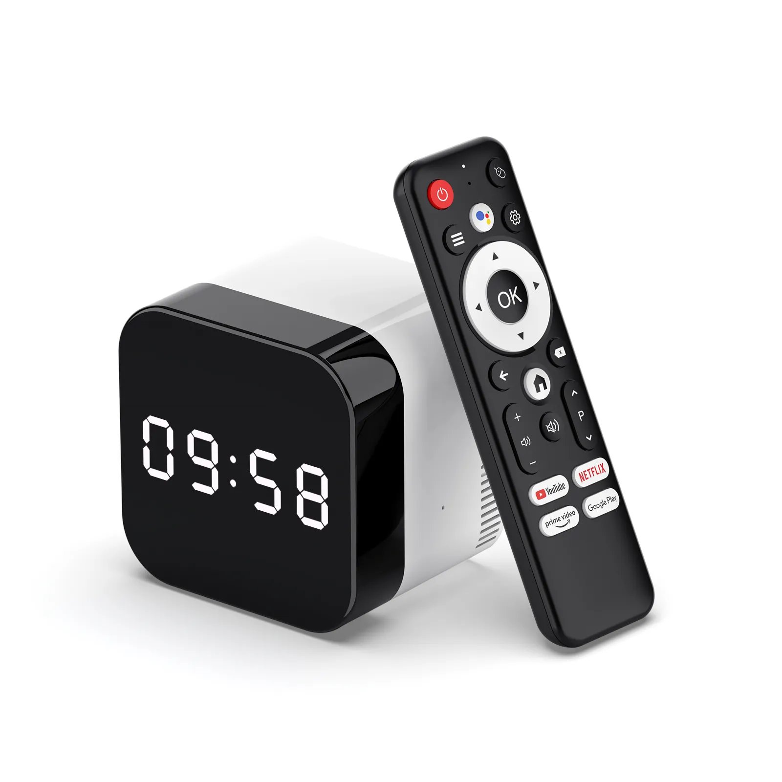
H728 · Wi‑Fi 6 · Gigabit LAN
H96 MAX H728 Android TV Box
H728 TV box with Wi‑Fi 6, Bluetooth 5.4, Gigabit Ethernet, USB 2.0 and USB 3.0.
Ask us to confirm available configurations, MOQ and lead time for this model.
Product details
Technical Specifications
Use these specifications to compare models. Available combinations are confirmed when you request a quote or sample.
| Specification | H728 | Ordering details |
|---|---|---|
| Chipset | H728 | |
| GPU | ARM G57 MC1 | |
| RAM | 2GB / 4GB DDR3 | Ask about available RAM and storage combinations. |
| Storage | 16GB / 32GB / 128GB eMMC | Ask about available RAM and storage combinations. |
| Operating system | Android 14 | |
| Wi‑Fi | 802.11 a/b/g/n/ax (Wi‑Fi 6) | |
| Bluetooth | Bluetooth 5.4 | |
| Ethernet | Gigabit Ethernet (1000M) | |
| Ports | USB 2.0, USB 3.0, HDMI, AV, LAN | Confirm the port layout on the order sample. |
| Video output | HDMI 2.1; up to 4K at 60fps | |
| Power | DC 5V / 2A | Adapter plug type is selected for the destination market. |
Model selection
Choose H728 when you need Gigabit LAN and USB 3.0.
H728 combines Wi‑Fi 6 and Bluetooth 5.4 with Gigabit Ethernet, USB 2.0 and USB 3.0.
- Orders that require Gigabit wired networking
- Projects that need a USB 3.0 connection
- Buyers comparing 2GB or 4GB RAM and several storage options
OEM/ODM
Customization Options
Tell us what you want to change. Available options, MOQ and schedule depend on the selected model and requirements.
Brand & packaging
Device branding, remote artwork, packaging and documentation.
Software & interface
Firmware, launcher, boot screen, apps and language requirements.
Hardware configuration
Memory, storage, network, ports, accessories and power requirements.
Buyer questions
Ordering & Customization FAQ
Is this model currently available?
Send the required configuration and quantity so we can confirm availability, MOQ and lead time.
Which memory and storage options can I order?
Listed options are 2GB or 4GB DDR3 and 16GB, 32GB or 128GB eMMC. Ask us to confirm available combinations, MOQ and lead time.
Can the device, UI or packaging be customized?
Branding, packaging, firmware, UI, app and hardware requests can be discussed. Available options depend on the model and order requirements.
Does this product carry Google, Netflix, Dolby or other certifications?
Certification or authorization must be confirmed for the exact model and hardware version required for your order.
How do I evaluate a sample?
Use Request a Sample and include the target market, required configuration and test points. We will confirm sample availability, cost and delivery terms.
Next step
Ask about H728 pricing and availability.
Include your target market, required configuration, quantity and customization needs.
(function () { ‘use strict’; const root = document.querySelector(‘.h96wp-v1’); if (!root) return; const routes = { home: root.dataset.homeUrl, contact: root.dataset.contactUrl }; function contactUrl(type, product) { const target = new URL(routes.contact); target.searchParams.set(‘h96_type’, type); if (product && type !== ‘support’) target.searchParams.set(‘h96_product’, product); return target.href; } const productData = { h728: { name: ‘H96 MAX H728 Android TV Box’, model: ‘H728’, position: ‘H728 · Wi‑Fi 6 · Gigabit LAN’, image: ‘https://tvboxinc.com/wp-content/uploads/2025/02/5.jpg’, imageAlt: ‘H96 H728 Android TV box with remote’, intro: ‘H728 TV box with Wi‑Fi 6, Bluetooth 5.4, Gigabit Ethernet, USB 2.0 and USB 3.0.’, quick: [[‘Chipset’, ‘H728’], [‘Operating system’, ‘Android 14’], [‘RAM’, ‘2GB / 4GB DDR3’], [‘Storage’, ’16GB / 32GB / 128GB eMMC’]], specs: [ [‘Chipset’, ‘H728’, ”], [‘GPU’, ‘ARM G57 MC1’, ”], [‘RAM’, ‘2GB / 4GB DDR3’, ‘Ask about available RAM and storage combinations.’], [‘Storage’, ’16GB / 32GB / 128GB eMMC’, ‘Ask about available RAM and storage combinations.’], [‘Operating system’, ‘Android 14’, ”], [‘Wi‑Fi’, ‘802.11 a/b/g/n/ax (Wi‑Fi 6)’, ”], [‘Bluetooth’, ‘Bluetooth 5.4’, ”], [‘Ethernet’, ‘Gigabit Ethernet (1000M)’, ”], [‘Ports’, ‘USB 2.0, USB 3.0, HDMI, AV, LAN’, ‘Confirm the port layout on the order sample.’], [‘Video output’, ‘HDMI 2.1; up to 4K at 60fps’, ”], [‘Power’, ‘DC 5V / 2A’, ‘Adapter plug type is selected for the destination market.’] ], fitHeading: ‘Choose H728 when you need Gigabit LAN and USB 3.0.’, fitCopy: ‘H728 combines Wi‑Fi 6 and Bluetooth 5.4 with Gigabit Ethernet, USB 2.0 and USB 3.0.’, fit: [‘Orders that require Gigabit wired networking’, ‘Projects that need a USB 3.0 connection’, ‘Buyers comparing 2GB or 4GB RAM and several storage options’], alternatives: [‘Choose M2 PLUS when you need the RK3528 platform and 100M Ethernet is sufficient.’, ‘Choose H313 when 2GB RAM and 8GB or 16GB storage meet the requirement.’], configFaq: ‘Listed options are 2GB or 4GB DDR3 and 16GB, 32GB or 128GB eMMC. Ask us to confirm available combinations, MOQ and lead time.’ }, ‘m2-plus’: { name: ‘H96 MAX M2 PLUS Android TV Box’, model: ‘M2 PLUS’, position: ‘RK3528 · Wi‑Fi 6 · 100M LAN’, image: ‘https://tvboxinc.com/wp-content/uploads/2025/06/2-1.jpg’, imageAlt: ‘H96 M2 PLUS Android TV box with remote’, intro: ‘M2 PLUS TV box with the Rockchip RK3528 platform, Wi‑Fi 6, Bluetooth 5.4 and 100M Ethernet.’, quick: [[‘Chipset’, ‘Rockchip RK3528’], [‘Operating system’, ‘Android 14’], [‘RAM’, ‘2GB / 4GB DDR’], [‘Storage’, ’16GB / 32GB / 128GB eMMC’]], specs: [ [‘Chipset’, ‘Rockchip RK3528’, ”], [‘CPU’, ‘Quad-core ARM Cortex-A53’, ”], [‘GPU’, ‘Mali-450 MP2’, ”], [‘RAM’, ‘2GB / 4GB DDR’, ‘Ask about available RAM and storage combinations.’], [‘Storage’, ’16GB / 32GB / 128GB eMMC’, ‘Ask about available RAM and storage combinations.’], [‘Operating system’, ‘Android 14’, ”], [‘Wi‑Fi’, ‘802.11 a/b/g/n/ax (Wi‑Fi 6)’, ”], [‘Bluetooth’, ‘Bluetooth 5.4’, ”], [‘Ethernet’, ‘100M Ethernet’, ”], [‘Ports’, ‘AV, HDMI, USB 2.0, LAN’, ‘Confirm port quantities and layout on the order sample.’], [‘Video output’, ‘HDMI 2.1; up to 4K at 60fps’, ”], [‘Power’, ‘DC 5V / 2A’, ‘Adapter plug type is selected for the destination market.’] ], fitHeading: ‘Choose M2 PLUS when you need the RK3528 platform.’, fitCopy: ‘M2 PLUS combines the RK3528 chipset with Wi‑Fi 6, Bluetooth 5.4 and 100M Ethernet.’, fit: [‘Projects that specify the Rockchip RK3528 platform’, ‘Buyers comparing 2GB or 4GB RAM and several storage options’, ‘Deployments where 100M wired networking meets the requirement’], alternatives: [‘Choose H728 when Gigabit Ethernet or USB 3.0 is required.’, ‘Choose H313 when 2GB RAM and 8GB or 16GB storage meet the requirement.’], configFaq: ‘Listed options are 2GB or 4GB RAM and 16GB, 32GB or 128GB eMMC. Ask us to confirm available combinations, MOQ and lead time.’ }, h313: { name: ‘H96 MAX H313 Android TV Box’, model: ‘H313’, position: ‘Allwinner H313 · 2GB RAM · 100M LAN’, image: ‘https://tvboxinc.com/wp-content/uploads/2024/11/8-2.jpg’, imageAlt: ‘H96 H313 Android TV box with remote’, intro: ‘H313 TV box with 2GB RAM, 8GB or 16GB storage, Wi‑Fi 6 and 100M Ethernet.’, quick: [[‘Chipset’, ‘Allwinner H313’], [‘Operating system’, ‘Android 14’], [‘RAM’, ‘2GB DDR3’], [‘Storage’, ‘8GB / 16GB eMMC’]], specs: [ [‘Chipset’, ‘Allwinner H313’, ”], [‘CPU’, ‘Quad-core ARM Cortex-A53’, ”], [‘GPU’, ‘Mali-G31’, ”], [‘RAM’, ‘2GB DDR3’, ”], [‘Storage’, ‘8GB / 16GB eMMC’, ‘Ask which storage option is available.’], [‘Operating system’, ‘Android 14’, ”], [‘Wi‑Fi’, ‘802.11 b/g/n/ac/ax (Wi‑Fi 6)’, ”], [‘Bluetooth’, ‘Bluetooth remote-control support’, ‘File transfer is not listed as supported.’], [‘Ethernet’, ‘100M Ethernet’, ”], [‘Ports’, ‘HDMI, 2 × USB 2.0, TF card slot, LAN’, ‘Confirm the port layout on the order sample.’], [‘Video output’, ‘HDMI 2.0; up to 4K at 60fps’, ”], [‘Power’, ‘DC 5V / 2A’, ‘Adapter plug type is selected for the destination market.’] ], fitHeading: ‘Choose H313 for a compact 2GB configuration.’, fitCopy: ‘H313 combines 2GB RAM, 8GB or 16GB storage, 100M Ethernet and two USB 2.0 ports.’, fit: [‘Orders that can use a fixed 2GB RAM configuration’, ‘Projects that need 8GB or 16GB storage’, ‘Deployments where 100M wired networking meets the requirement’], alternatives: [‘Choose M2 PLUS when 4GB RAM, higher storage or the RK3528 platform is required.’, ‘Choose H728 when Gigabit Ethernet and USB 3.0 are required.’], configFaq: ‘Listed options are 2GB DDR3 with 8GB or 16GB eMMC. Ask us to confirm the available storage option, MOQ and lead time.’ } }; const contactData = { quote: { title: ‘Request a Quote’, selection: ‘Quote’, intro: ‘Tell us the model, target market, quantity and configuration you need.’, kicker: ‘Bulk purchasing’, asideTitle: ‘What to include’, asideCopy: ‘These details help us review the right product and configuration.’, checklist: [‘Country or target market’, ‘Intended use and preferred model’, ‘Expected quantity or quantity range’, ‘Required configuration and delivery destination’], requirementsLabel: ‘Purchasing requirements *’, placeholder: ‘Target market, intended use, preferred model, expected quantity, configuration and delivery destination.’, submit: ‘Send Quote Request’ }, customization: { title: ‘Discuss Customization’, selection: ‘Customization’, intro: ‘Tell us which product, branding, packaging, software or hardware changes you need.’, kicker: ‘OEM / ODM’, asideTitle: ‘What to include’, asideCopy: ‘Customization options are confirmed for the selected model and order.’, checklist: [‘Preferred model or chipset’, ‘Branding and packaging requirements’, ‘Firmware, UI or app requirements’, ‘Hardware, ports or accessory requirements’], requirementsLabel: ‘Customization requirements *’, placeholder: ‘Branding, packaging, firmware, launcher, apps, hardware, ports, accessories or documentation needs.’, submit: ‘Send Customization Request’ }, sample: { title: ‘Request a Sample’, selection: ‘Sample’, intro: ‘Tell us the model, configuration and test requirements for your evaluation.’, kicker: ‘Sample evaluation’, asideTitle: ‘What to include’, asideCopy: ‘Sample availability, cost and delivery terms are confirmed before shipment.’, checklist: [‘Target market and intended use’, ‘Model and required configuration’, ‘Evaluation or acceptance points’, ‘Expected follow-on quantity, if known’], requirementsLabel: ‘Sample requirements *’, placeholder: ‘Model, configuration, target market, evaluation points and expected follow-on quantity.’, submit: ‘Send Sample Request’ }, support: { title: ‘Existing Device Support’, selection: ‘Device support’, intro: ‘Share the exact model, purchase source, firmware version and issue.’, kicker: ‘Device support’, asideTitle: ‘What to include’, asideCopy: ‘Use the information printed on the device or packaging.’, checklist: [‘Exact model and hardware version’, ‘Order source and approximate purchase date’, ‘Firmware or build information’, ‘Symptoms and troubleshooting already attempted’], requirementsLabel: ‘Device issue *’, placeholder: ‘Model, hardware or firmware version, purchase source, symptoms and steps already tried. Do not include passwords.’, submit: ‘Send Support Request’ } }; const sharedDraftFields = [‘name’, ’email’, ‘market’, ‘requirements’, ‘company’, ‘whatsapp’]; const draftKey = ‘h96-v1-contact-draft’; const recaptchaSiteKey = ‘6Leod7UgAAAAABH9Ftx1JbKeUiQS3I4L5K_M6Ada’; function loadRecaptcha() { if (window.grecaptcha && typeof window.grecaptcha.execute === ‘function’) return Promise.resolve(); const existing = root.querySelector(‘script[data-h96-recaptcha]’); if (existing) return new Promise((resolve, reject) => { existing.addEventListener(‘load’, resolve, { once: true }); existing.addEventListener(‘error’, reject, { once: true }); }); return new Promise((resolve, reject) => { const script = document.createElement(‘script’); script.src = `https://www.google.com/recaptcha/api.js?render=${encodeURIComponent(recaptchaSiteKey)}`; script.async = true; script.defer = true; script.dataset.h96Recaptcha = ‘true’; script.addEventListener(‘load’, resolve, { once: true }); script.addEventListener(‘error’, reject, { once: true }); document.head.appendChild(script); }); } async function recaptchaToken() { await loadRecaptcha(); return new Promise((resolve, reject) => { window.grecaptcha.ready(() => { window.grecaptcha.execute(recaptchaSiteKey, { action: ‘contactform’ }).then(resolve).catch(reject); }); }); } function params() { return new URLSearchParams(window.location.search); } function selectedProduct() { const key = root.dataset.product || params().get(‘h96_product’) || ‘h728’; return productData[key] ? { key, data: productData[key] } : { key: ‘h728’, data: productData.h728 }; } function setText(selector, value) { root.querySelectorAll(selector).forEach((node) => { node.textContent = value; }); } function trackAcquisitionEvent(eventName, parameters) { const safeParameters = Object.assign({ transport_type: ‘beacon’, send_to: ‘G-RHG3G8F4ZC’ }, parameters || {}); if (typeof window.gtag === ‘function’) { window.gtag(‘event’, eventName, safeParameters); return; } window.dataLayer = window.dataLayer || []; window.dataLayer.push(Object.assign({ event: eventName }, safeParameters)); } if (!window.__h96WhatsAppTrackingBound) { window.__h96WhatsAppTrackingBound = true; document.addEventListener(‘click’, (event) => { const link = event.target.closest(‘a[href*=”wa.me/”]’); if (!link) return; trackAcquisitionEvent(‘h96_whatsapp_click’, { link_destination: ‘whatsapp’, page_path: window.location.pathname }); }); } const menuButton = root.querySelector(‘.menu-toggle’); const menu = root.querySelector(‘.primary-nav’); if (menuButton && menu) { menuButton.addEventListener(‘click’, () => { const open = menuButton.getAttribute(‘aria-expanded’) === ‘true’; menuButton.setAttribute(‘aria-expanded’, String(!open)); menu.classList.toggle(‘is-open’, !open); document.body.classList.toggle(‘menu-open’, !open); }); menu.addEventListener(‘click’, (event) => { if (event.target.closest(‘a’)) { menuButton.setAttribute(‘aria-expanded’, ‘false’); menu.classList.remove(‘is-open’); document.body.classList.remove(‘menu-open’); } }); } if (root.dataset.page === ‘contact’) { const query = params(); const type = contactData[query.get(‘h96_type’)] ? query.get(‘h96_type’) : ‘quote’; const content = contactData[type]; let productKey = query.get(‘h96_product’); let product = productData[productKey]; if (type === ‘support’ && productKey) { const cleanUrl = new URL(window.location.href); cleanUrl.searchParams.delete(‘h96_product’); window.history.replaceState({}, ”, cleanUrl); productKey = null; product = null; } document.title = `${content.title} | H96`; setText(‘[data-contact=”title”]’, content.title); setText(‘[data-contact=”intro”]’, content.intro); setText(‘[data-contact=”kicker”]’, content.kicker); setText(‘[data-contact=”asideTitle”]’, content.asideTitle); setText(‘[data-contact=”asideCopy”]’, content.asideCopy); setText(‘[data-contact=”requirementsLabel”]’, content.requirementsLabel); setText(‘[data-contact=”submitLabel”]’, content.submit); setText(‘[data-contact=”selectionType”]’, content.selection); root.querySelector(‘[data-contact=”placeholder”]’).placeholder = content.placeholder; root.querySelector(‘[data-contact=”checklist”]’).innerHTML = content.checklist.map((item) => `